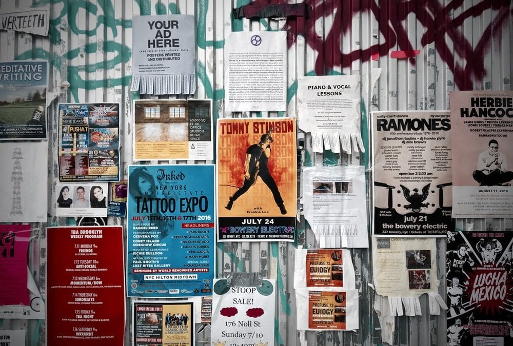
Every day we are bombarded with thousands of marketing messages that we’re usually not even aware of. We’re so saturated with advertising messages these days that as modern humans, we’ve evolved to be able to ‘block out’ marketing noise.
But when it comes to getting your message out there, large poster printing is still an effective method. When designing your poster, it helps to keep the below tips in mind.
Make sure the text is easy to read from a distance
This is a bit of a no brainer but overly stylised fonts, muted colours and large chunks of small text are not going to make your message clear. You want a poster with a direct message that is easily understandable from a simple glance.
Use contrasting colours to make your design stand out
It may be tempting to go with a pretty colour scheme or your brand’s usual muted colours, however, that isn’t necessarily going to catch people’s attention even if it does look on brand or stylish.
Test your design in different sizes
You need to make sure your design is scalable. Depending on your marketing plan, it may need to be reprinted in different sizes in order to be used in different locations and for different contexts.
Image first text later
Even the most well-crafted copy is redundant without an impactful – and large – image. At least half of your poster should be made up of imagery.
What’s your call to action?
Make it clear, catchy and most of all, make sure it stands out.
At Athlone Printing, we are experts in large format printing. And it’s not only posters that we’re good at. We can help with all types of printing and binding services. So if you have one design or multiple concepts that you want to adapt across a set of marketing materials, give us a try! Simply contact us today via email or give us a call to talk about your upcoming printing project.

